
A Visual Guide to Pissing Off The Financial World
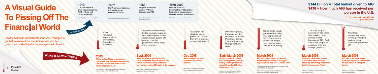
A Visual Guide To Pissing Off The Financlal World $144 Billion = Total bailout given to AIG $436 = How much AIG has received per person in the U.S. ??? = How much more AIG will 1919 C.V. Starr founds a small insurance agency, AAU, in China and 1970-2000 Over the years AIG becomes the world's leading international insurance and financial services organization 1969 1967 Starr's company becomes AIG, the American International Group AIG goes public with Maurice R"Hank" Greenburg as CEO begins expanding http://nyjobsource.com/aig.html http://nyjobsource.com/aig.html Hoover's Handbook of American Business (9th ed.) http://nyjobsource.com/aig.html piss people off Tempers are soothed by the big bucks brought in from Washington. A few people remain pissed off because now the government owns most 303,824,560 people get pissed off. (The total population of the U.S. minus the number of people receiving bonuses from bailout money. The only people pissed now are those that used to have million dollar bonuses at AIG. And also a few people in congress who are always pissed off. Taxpayers are starting to get pissed off. Didn't People are pissed, but many are too scared to be pissed. People are losing Americans The Background A few thousand everywhere swear violently. People in How the American International Group (AIG) managed to get itself in a whole lot of trouble financially, with the government, and with just about every person in America. stock holders are worried. Several are they get a bunch of money last month? jobs and just hope things work out Soon. various other countries get pissed off. pissed off. of the company. Early March 2009 AIG announces $61 billion loss - the largest in corporate history. The US government gives AIG another $30 billion Where It All Went Wrong 2005 After a series of fraud investigations by the New York State Attorney General's Office AIG is fined $1.6 billion. A new CEO is appointed at AIG. Sept. 2008 AIG suffers froma massive liquidity crisis. The Federal Reserve rescues AIG with an $85 billion bailout, and the US Oct. 2008 AIG borrows $37.8 billion more from the Federal March 2009 AIG uses bailout money to pay over $165 million in bonuses to managers. 78 people were paid over $1 million each. March 2009 Congress immediately passes a 90% tax on AIG's bonuses, effectively transferring that money March 2009 AIG tries to get some money back by suing the US Government for $306 million in "overpaid Reserve govemment receives 80% stake in the company. back to the American Public. taxes". Pissed Off O-Meter http://www.propublica.org/article/ timeline-aig-and-their-bonuses in bailout money. http://www.reuters.com/article/GCA-CreditCrisis/ idUKTRE52K19L20090323 http://finance.yahoo.com/news/AIG-executive- sentenced-to-4-apf-14168709.html http://www.nytimes.com/2008/09/17/ business/17insure.html?hp http://www.propublica.org/article/ timeline-aig-and-their-bonuses https://www.cia.gov/library/publications/ the-world-factbook/print/us.html http://www.politico.com/news/stories/ 0309/20235.html http://www.nytimes.com/2009/03/20/ business/20aig.html
A Visual Guide to Pissing Off The Financial World
Source
Unknown. Add a sourceCategory
EconomyGet a Quote
You may also like...


