
Teach yourself All You Need to Know to Create Visual Harmony with Colors
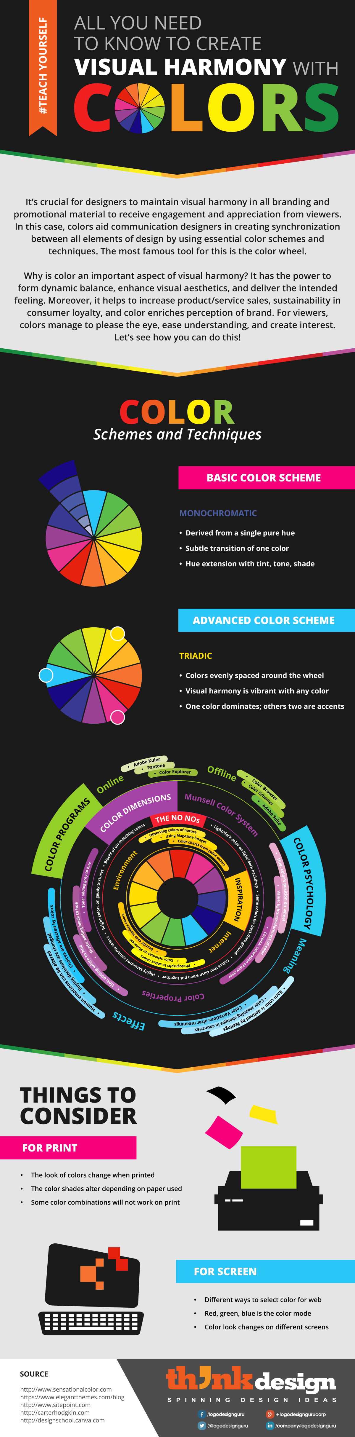
ALL YOU NEED ΤΟ ΚΝOW ΤO CRΕAΤΕ VISUAL HARMONY WITH COLORS It's crucial for designers to maintain visual harmony in all branding and promotional material to receive engagement and appreciation from viewers. In this case, colors aid communication designers in creating synchronization between all elements of design by using essential color schemes and techniques. The most famous tool for this is the color wheel. Why is color an important aspect of visual harmony? It has the power to form dynamic balance, enhance visual aesthetics, and deliver the intended feeling. Moreover, it helps to increase product/service sales, sustainability in consumer loyalty, and color enriches perception of brand. For viewers, colors manage to please the eye, ease understanding, and create interest. Let's see how you can do this! COLOR Schemes and Techniques BASIC COLOR SCHEME MONOCHROMATIC • Derived from a single pure hue • Subtle transition of one color • Hue extension with tint, tone, shade ADVANCED COLOR SCHEME TRIADIC • Colors evenly spaced around the wheel • Visual harmony is vibrant with any color • One color dominates; others two are accents Adobe Kuler Pantone Offline Color Explorer Munsell Color System Color Browser Color Schemer GRAMS Online THE NO NOs ly saturated rainbow colors • Bright colors on gaudy textures • Blocks of un-matching colors • Light/dark color on light/dark backdrop • Same colors for back/fore ground • Colors that clasi COLOR DIMENSIONS Observing colors of nature Using Magazine Color charts from paint sellers images • Brands' case studies colors Internet chemes on PinteresstI Photographs to select colors Color Variations alter meanings • Color meaning changes in countries • Each color is defined by feelings color Properties Effects THINGS TO CONSIDER FOR PRINT The look of colors change when printed The color shades alter depending on paper used Some color combinations will not work on print FOR SCREEN Different ways to select color for web Red, green, blue is the color mode Color look changes on different screens desigm לL SOURCE http://www.sensationalcolor.com https://www.elegantthemes.com/blog http://www.sitepoint.com http://carterhodgkin.com http://designschool.canva.com IDE A S DESIGN S PINNING 8. +logodesigngurucorp f /logodesignguru in /company/logodesignguru y @logodesignguru aning COLOR PSYCHOLOGY ue: color's position on wheel C Chroma: saturation of any color (• Value: lightness/darkness of color INSPIRATION Tint: adding white to hue • Adobe Suite • Buying Shade: adding black to hue ở decisions are changed • Human emotions can be altere Environment • Tone: adding g • Choices are affected by colors grey to hue #TEACH YOURSELF
Teach yourself All You Need to Know to Create Visual Harmony with Colors
Source
http://blog....th-colors/Category
BusinessGet a Quote
You may also like...


