Maps of Ratio and Number of Linux Users per Country
shared by gmz on Mar 03
921
views
0
faves
0
comments
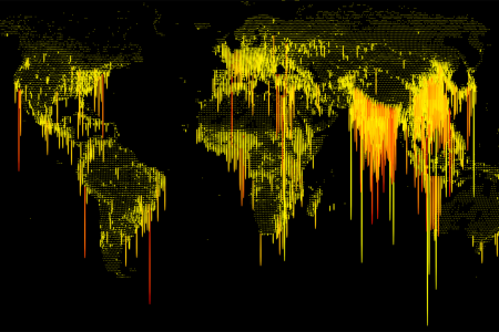
These 2 maps show the ratio and total number of registered Linux users per country from the Linux Counter project as of March 3, 2014. Created with D3.js.

Source
http://www.l...unter-map/Category
ComputersGet a Quote
You may also like...