
How to optimize registration forms?
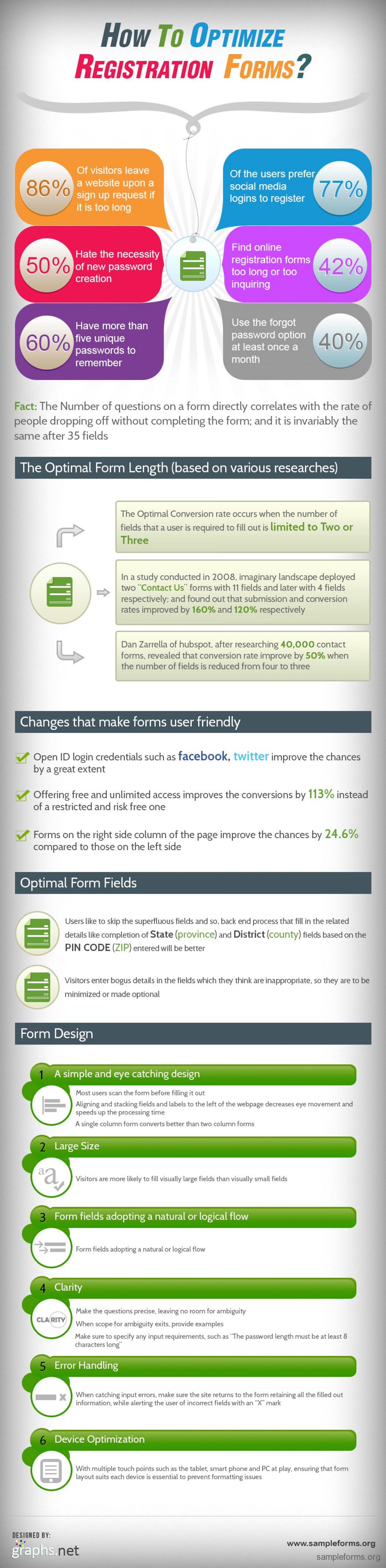
How To OPTIMIZE REGISTRATION FORMS? Of visitors leave a website upon a sign up request if it is too long Of the users prefer 86% 77% social media logins to register Find online Hate the necessity 50% of new password registration forms too long or to0 inquiring 42% creation Use the forgot password option at least once a Have more than 60% five unique passwords to 40% remember month Fact: The Number of questions on a form directly correlates with the rate of people dropping off without completing the form; and it is invariably the same after 35 fields The Optimal Form Length (based on various researches) The Optimal Conversion rate occurs when the number of fields that a user is required to fill out is limited to Two or Three In a study conducted in 2008, imaginary landscape deployed two "Contact Us" forms with 11 fields and later with 4 fields respectively; and found out that submission and conversion rates improved by 160% and 120% respectively Dan Zarrella of hubspot, after researching 40,000 contact forms, revealed that conversion rate improve by 50% when the number of fields is reduced from four to three Changes that make forms user friendly Open ID login credentials such as facebook, twitter improve the chances by a great extent Offering free and unlimited access improves the conversions by 113% instead of a restricted and risk free one Forms on the right side column of the page improve the chances by 24.6% compared to those on the left side Optimal Form Fields Users like to skip the superfluous fields and so, back end process that fill in the related details like completion of State (province) and District (county) fields based on the PIN CODE (ZIP) entered will be better Visitors enter bogus details in the fields which they think are inappropriate, so they are to be minimized or made optional Form Design A simple and eye catching design Most users scan the form before filling it out E Aligning and stacking fields and labels to the left of the webpage decreases eye movement and speeds up the processing time A single column form converts better than two column forms 2 Large Size Visitors are more likely to fill visually large fields than visually small fields 3 Form fields adopting a natural or logical flow Form fields adopting a natural or logical flow 4 Clarity Make the questions precise, leaving no room for ambiguity CLA RITY When scope for ambiguity exits, provide examples Make sure to specify any input requirements, such as 'The password length must be at least 8 characters long" 5 Error Handling x) When catching input errors, make sure the site returns to the form retaining all the filled out information, while alerting the user of incorrect fields with an "X" mark 6 Device Optimization With multiple touch points such as the tablet, smart phone and PC at play, ensuring that form layout suits each device is essential to prevent formatting issues DESIGNED BY: www.sampleforms.org graphs.net sampleforms.org How To OPTIMIZE REGISTRATION FORMS? Of visitors leave a website upon a sign up request if it is too long Of the users prefer 86% 77% social media logins to register Find online Hate the necessity 50% of new password registration forms too long or to0 inquiring 42% creation Use the forgot password option at least once a Have more than 60% five unique passwords to 40% remember month Fact: The Number of questions on a form directly correlates with the rate of people dropping off without completing the form; and it is invariably the same after 35 fields The Optimal Form Length (based on various researches) The Optimal Conversion rate occurs when the number of fields that a user is required to fill out is limited to Two or Three In a study conducted in 2008, imaginary landscape deployed two "Contact Us" forms with 11 fields and later with 4 fields respectively; and found out that submission and conversion rates improved by 160% and 120% respectively Dan Zarrella of hubspot, after researching 40,000 contact forms, revealed that conversion rate improve by 50% when the number of fields is reduced from four to three Changes that make forms user friendly Open ID login credentials such as facebook, twitter improve the chances by a great extent Offering free and unlimited access improves the conversions by 113% instead of a restricted and risk free one Forms on the right side column of the page improve the chances by 24.6% compared to those on the left side Optimal Form Fields Users like to skip the superfluous fields and so, back end process that fill in the related details like completion of State (province) and District (county) fields based on the PIN CODE (ZIP) entered will be better Visitors enter bogus details in the fields which they think are inappropriate, so they are to be minimized or made optional Form Design A simple and eye catching design Most users scan the form before filling it out E Aligning and stacking fields and labels to the left of the webpage decreases eye movement and speeds up the processing time A single column form converts better than two column forms 2 Large Size Visitors are more likely to fill visually large fields than visually small fields 3 Form fields adopting a natural or logical flow Form fields adopting a natural or logical flow 4 Clarity Make the questions precise, leaving no room for ambiguity CLA RITY When scope for ambiguity exits, provide examples Make sure to specify any input requirements, such as 'The password length must be at least 8 characters long" 5 Error Handling x) When catching input errors, make sure the site returns to the form retaining all the filled out information, while alerting the user of incorrect fields with an "X" mark 6 Device Optimization With multiple touch points such as the tablet, smart phone and PC at play, ensuring that form layout suits each device is essential to prevent formatting issues DESIGNED BY: www.sampleforms.org graphs.net sampleforms.org
How to optimize registration forms?
Source
http://www.s...forms.htmlCategory
BusinessGet a Quote