The DNA of Olympic Glory
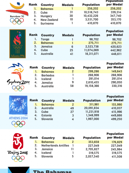
THE DNA OF PROPORTIONAL OLYMPIC GLORY population-per-medal throughout the history of the modern Olympic games Flush with Olympic Glory Average Historic Glory Glory Spread Pretty Thin 2012 2008 2004 2000 1996 1992 1988 1984 1980 1976 1972 1968 1964 1960 1956 1952 1948 1936 1932 1928 1924 1920 1912 1908 1904 1900 1896 Bermuda 53,200 Tonga Virgin Islands 98,702 104,500 Grenada 110,821 Bahamas 353,658 176,829 155,990 149,643 275,711 256,202 134,072 99,881 Netherlands Antilles 227,049 188,025 Iceland 319,575 281,014 239,000 179,666 Luxembourg 299,000 217,000 Barbados 268,906 East Germany 157,950 132,539 186,511 258,227 683,360 Suriname 410,870 395,548 Estonia 659,002 659,002 449,666 457,307 773,500 161,353 223,286 185,711 364,679 Djibouti Montenegro 499,258 620,029 Belarus 727,800 497,968 651,290 595,621 677,333 Trinidad and Tobago 329,428 658,857 1,301,307 577,636 610,353 1,022,655 295,248 331,475 600,000 Qatar 849,717 606,339 502,284 Hungary Australasia 586,000 996,200 593,070 599,230 491,007 347,740 453,042 334,629 481,318 296,971 320,864 443,757 475,428 382,596 225,047 341,516 569,734 585,573 955,283 917,288 974,225 834,333 1,831,750 1,370,883 1,142,634 664,549 798,072 Slovenia 514,385 411,508 499,250 988,185 990,116 992,234 Finland 1,802,346 1,351,760 2,614,047 1,294,049 1,278,125 1,001,617 1,238,175 407,158 598,473 787,666 580,000 1,156,500 909,800 886,000 295,874 185,158 202,030 194.418 145,306 136,160 88,936 92,576 117,269 594,960 Jamaica 245,984 528,400 420,623 71,000 1,823,706 225,485 290,050 605,761 1,178,200 759,966 1,018,858 1,934,162 289,339 448,333 Guyana 760,860 Namibia 851,606 739,185 Cyprus New Zealand 838,897 340,970 492,513 811,789 961,280 622,000 353,170 257,692 295,709 777,750 970,355 916,611 517,000 795,933 1,125,883 677,277 1,573,804 1,530,850 1,459,800 1,410,000 1,240,800 Denmark 620,057 797,216 675,306 889,557 883,199 861,666 1,282,500 852,000 1,024,413 1,691,000 4,992,000 608,291 786,666 763,500 1,116,500 722,444 209,500 742,834 600,500 581,722 381,617 235,615 232,833 533,600 405,166 410,795 Norway 609,196 1,251,425 500,570 764,361 448,355 621,476 841,150 1,380,000 2,013,000 981,983 1,877,133 3570.554 1,136,053 673,616 456,035 483,133 695,233 272,573 85,476 269,222 292,175 445,800 Sweden 1,186,335 1,898,136 1,238,851 739,195 1,104,489 719,453 766,954 438,887 692,500 1,645,346 507,625 1,978,500 957,625 1,246,666 384,105 204,314 156,727 312,950 268,938 246,078 207,794 91,812 86,218 216,672 5,150,000 Georgia 638,457 744,866 1,172,239 786,676 2,370,948 Latvia 1,035,185 690,123 578,197 790,666 2,479,666 880,111 980,500 1,931,000 Australia 653,731 497,404 410,037 330,316 446,611 647,962 1,168,636 647,666 1,619,387 2,787,932 772,965 702,295 620,388 468,840 269,305 778,613 592,987 6,778,372 1,312,020 1,514,113 946,984 1,808,570 758,664 1,792,935 Slovakia 1,361,331 907,554 899,359 1,080,663 1,767,792 Bahrain 1,234,571 1,234,571 Czech Republic 1,050,420 1,750,700 1,277,324 1,284,116 937,912 Mauritius 1,286,051 Mongolia Bulgaria 547,360 684,200 2,737,118 2,374,906 1,217,621 2,031,974 421,916 1,504,213 1,333,214 296,798 3,682,285 1,472,914 652,374 603,240 557,066 532,652 256,866 216,850 398,136 410,790 929,977 814,400 1,159,415 1,520,227 7,274,900 Croatia 715,102 858,122 895,129 2,214,536 2,210,369 1,560,362 Lithuania 638,560 638,560 1,155,214 719,802 3,605,000 1,850,000 Czechoslovakia 1,161,177 1,045,060 1,474,000 1,294,500 730,857 1,263,000 1,235,375 756,820 691,952 1,368,468 1,819,925 901,284 942,840 1,587,745 3,174,298 4,150,321 Cuba 468,381 384,206 442,962 339,314 208,777 802,940 415,996 483,552 731,013 1,105,606 2,053,856 7,592,010 5,284,000 750,000 Gabon 1,534,000 Netherlands 836,588 1,045,735 740,907 636,353 816,877 1,011,866 1,640,000 1,109,384 4,716,666 2,754,800 2,661,840 1,819,070 1,212,700 3,828,140 2,065,660 608,995 488,458 1,160,285 402,105 684,800 621,590 2,014,500 2,636,500 1,340,012 Switzerland 1,967,525 1,311,683 1,481,318 798,974 1,011,094 6,897,000 1,644,250 805,829 3,167,333 1,582,916 2,114,555 1,213,600 1,447,250 893,665 5,278,685 343,928 229,966 273,395 4,026,773 266,000 156,212 352,654 1,712,700 368,380 980,533 Kazakhstan 1,286,000 1,286,000 1,869,560 2,258,344 1,416,175 Armenia 1,089,500 544,750 3,169,445 1,696,506 British West Indies 1,632,300 West Germany 1,814,066 1,224,527 1,721,623 1,529,675 2,314,038 Panama 3,405,813 415,500 Uruguay 3,227,565 2,879,041 2,483,538 1,127,160 1,072,000 1,788,000 1,669,000 1,553,000 Macedonia 2,015,971 Botswana 2,038,228 Lebanon 2,784,713 2,580,793 750,000 Serbia 1,780,166 2,373,555 Ukraine 2,282,220 1,690,534 2,066,870 2,137,749 2,219,877 Ireland 917,650 1,529,417 3,801,328 908,433 1,775,533 3,529,000 1,708,450 2,857,000 579,637 2,951,000 1,478,000 2,940,000 United States 3,013,288 2,848,927 2,907,864 3,002,382 2,653,392 2,346,353 2,601,053 1,355,316 2,319,521 2,209,233 1,871,685 2,132,100 2,538,334 2,361,986 2,065,184 1,774,261 2,288,185 1,212,394 2,167,979 1,125,385 1,116,016 1,496,817 1,912,400 335,486 1,620,697 3,590,068 Haiti 2,316,200 2,018,666 Soviet Union 1,394,871 2,356,802 2,178,750 2,060,606 2,099,488 2,650,868 2,486,296 2,116,504 2,567,901 Unified Team 2,232,142 Moldova 1,779,750 3,559,500 2,120,254 2,197,332 Germany 1,859,795 1,995,878 1,683,070 1,465,535 1,260,184 983,219 1,499,080 1,730,333 2,770,153 2,871,722 756,741 3,286,000 2,089,838 2,646,000 4,835,384 4,440,128 7,014,841 4,141,025 France 1,922,058 1,633,750 1.824,174 1,553,690 1,571,414 1,974,662 3,515,598 1.962,392 3,859,157 5,882,888 3,977,000 3,327,323 3,220,666 9.136,800 3,092,934 2,294,777 1,426,068 2,229,502 2,194,315 1,943,595 1,047,118 952,097 2.916,666 2,133,807 379,207 3,601,000 Puerto Rico 1,862,894 3,740,766 3,597,031 1,672,095 3,043,855 2,176,666 Costa Rica 1,772,071 3,441,399 3,118,636 Canada 1,931,744 1,931,744 2,638,861 2,201,897 1,317,472 1,581,781 2,658,000 573,075 2,122,078 4,400,200 4,148,800 4,831,250 18.005,670 2,682,500 4,901,444 4,406,111 1,243,592 700,666 655,666 2,286,416 950,296 914,758 438,312 971,166 2,652,000 Azerbaijan 911,110 1,301,585 1,621,079 2,684,815 7,750,733 Kuwait 3,582,054 2,190,000 Italy Belgium 2,170,590 2,170,590 1,816,750 1,682,003 1,623,844 2,988,917 4,044,928 1,769,916 3,763,776 4,225,174 3,021,166 3,327,250 1,916,750 1,399,958 1,982,394 2,256,428 1,717,814 1,951,981 1,155,000 2,108,105 2,390,166 1,645,086 5,878,200 8,686,754 8,106,250 3,650,422 5,475,633 3,445,166 2,049,633 1,692,333 3,334,656 4,955,266 2,463,808 9,847,666 1,635,750 4,857,483 4,801,983 3,130,345 2,284,000 4,499,066 2,182,500 1,222,428 4,151,266 2,662,222 588,153 207,733 1,249,210 919,000 447,933 Great Britain 957,876 1,324,723 1,930,138 2,129,543 3,884,508 2,882,072 2,385,486 1,527,189 2,682,380 4,327,926 3,116,494 4,247,230 2,996,092 2,618,616 2,182,208 4,578,318 2,175,043 3,209,523 3,010,520 2,301,900 1,296,256 1,100,500 1,083,756 281,703 19,159,350 1,183,500 5,097,290 Singapore 2,591,850 5,183,700 1,646,133 Austria 2,817,611 1,167,938 2,670,520 2,654,988 3,932,633 7,591,922 2,518,333 1,888,250 7,556,666 2,503,333 1,840,500 3,635,416 3,508,000 3,464,000 1,738,250 519,846 1,345,000 2,214,333 1,640,500 1,681,000 6,485,000 6,228,000 998,066 4,992,200 Romania 2,115,881 2,380,367 1,186,382 853,014 1,114,546 1,265,262 923,840 426,882 888,040 794,296 1,291,431 1,314,733 1,679,972 1,840,300 1,345,343 4,264,931 18,672,618 16,990,000 United Arab Emirates 3,599,666 Yugoslavia Kyrgyzstan Kenya Serbia and Montenegro 3,449,491 2,654,379 1,950,000 1,246,573 2,621,280 2,802,395 4,104,594 1,048,125 1,591,760 9,200,500 2,527,666 2,430,500 7,850,000 11,894,911 1,102,020 2,117,015 2,738,800 4,915,300 3,510,008 2,757,864 4,781,047 4,350,898 3,510,766 3,127,321 2,728,907 6,419,686 1,526,791 1,169,166 9,176,796 4,042,406 Greece 676,297 1,334,781 4,948,000 2,695,000 5,393,845 2,696,922 827,654 5,185,000 10,037,000 3,214,222 4,444,500 8,741,000 8,327,000 8,129,666 5,033,450 1,748,666 2,551,000 52,908 North Korea 4,008,705 4,511,982 5,484,808 4,226,814 3,439,246 8,136,163 4,008,705 2,310,975 2,021,200 Bohemia 4,947,500 3,668,268 Eritrea 4,375,384 Poland 3,850,100 3,850,100 3,833,051 2,760,571 2,271,647 2,019,194 2,389,895 1,115,081 1,321,615 1,574,666 1,794,722 1,354,826 1,407,666 3,173,555 6,345,125 23,980,000 5,636,666 4,599,871 6,066,000 14,282,000 Ceylon Niger 4,697,000 4,866,367 Zimbabwe 3.188,500 4,268,026 7,310,103 Israel 7,859,300 3,430,500 6,338,133 5,692,000 2,561,500 Tunisia 3,557,933 10,673,800 9,103,533 5,294,325 2,466,565 2,268,805 Tajikistan Paraguay Togo Dominican Republic 7,616,000 3,808,000 5.922,514 6,191,155 4,689,409 4,689,409 9,324,633 6,293,215 Portugal Hong Kong Uzbekistan 10,561,614 5,280,807 3,429,437 5,112,900 5,026,433 9,683,700 3,339,538 4,677,500 8,897,170 8.503.120 4,131,000 7,338,000 6,774,255 6,217,663 7,103,700 6,962,569 6.363,000 7,280,850 4,853,900 5,197,015 6,162,500 11,612,500 South Korea 1,660,050 1,735,000 1,567,096 1,606,236 1,679,012 1,539,201 1,273,666 2,118,122 5,974,833 33,345,433 15,419,000 9,278,966 11,075,181 10,271,666 9,704,682 Iraq Senegal 7,332,126 7,523,057 Russia 1,744,590 1,986,894 1,546,667 1,648,666 2,347,291 17,680,400 27,500,666 Zambia 9,601,556 6,504,934 South Africa 8,866,666 8,339,730 2,989,250 1.764,933 2.795,500 8,431,126 50,586,757 7,783,333 18,475,880 5,488,000 4,232,166 1,395,531 10.000,000 2.592,533 2,431,300 695,300 1,012,333 Burundi 8,135,452 Chile 17,402,630 5,341,288 15,411,830 13,424,960 2,179,250 3,175,666 4,164,900 Tanzania 9,340,715 Japan Argentina 3,359,210 5,106,000 3,449,225 7,048,867 8,978,386 5,634,199 8,796,720 3,772,040 4,499,755 3,656,276 4,077,894 3,365,908 5,227,555 4,726,325 9,511,629 3,884,672 3,633,932 12,261,576 59,250,574 27,981,534 10,029,274 6,686,182 6,216,536 9,214,618 11,755,283 33,217,893 15,811,480 24,373,967 11,603,970 21,953,920 10,372,003 9,863,001 3,564,800 2,427,062 1,945,714 3,391,485 1,611,714 1,648,004 Ghana 12,821,052 16,164,905 7,864,510 6,852,515 CÃ te d’Ivoire 11,795,650 Turkey 14,944,853 9,340,533 7,039,780 13,250,223 10,508,418 9,704,388 26,861,500 16,358,666 37.189,780 16,788,903 5,065,340 3,056,555 3,738,571 7,147,611 1,642,583 8,338,000 Taiwan 11,617,001 5,808,500 4,551,045 4,470,072 21,505,560 20,802,866 18,451,500 Morocco 32,526,800 16,263,400 10,209,604 5,930,358 13,429,200 8,369,894 7,740,831 10,653,125 11,634,810 Cameroon 19,406,100 16,623,500 15,139,138 9,783,702 6,314,845 Venezuela 27,150,095 27,150,095 13,063,500 5,664,360 15,068,813 13,166,660 9,408,560 7,578,904 5,391,000 Ecuador 14,483,499 13,299,776 Spain Syria 2,717,428 2,566,459 2,204,639 3,626,556 2,317,963 1,783,005 9,672,758 7,654,600 6,231,000 17,968,500 34,489,333 30,455,080 28,474,000 28,524,080 23.953.500 23,217,666 10,622,733 19,263,333 18,393,723 15,074,022 10,273,400 Guatemala 14,713,763 Ethiopia Uganda 12,045,855 12,045,855 9,994,405 8,022,996 18,882,807 17,941,777 9,289,204 15,239,570 12,724,350 24,785,790 23,481,000 32,939,800 21,533,240 12,597,066 4,928,926 4,462,130 Iran 6,359,083 38,154,500 11,219,190 16,078,970 19,959,780 19,683,700 51,736,581 16,319,550 10.028,333 5,381,290 12,057,692 5,388,500 4,140,533 2,438,142 16,168,000 Algeria Mozambique 37,100,000 18,550,000 6,190,064 9,621,235 13,204,707 10,716,365 18,308,580 16,839,733 Peru 22,549,560 21,061,497 19,096,973 7,646,333 Malaysia 14,167,067 28,334,135 10,446,075 18,817,280 Saudi Arabia 27,136,977 10,784,618 Sri Lanka 19.278,725 China 15,486,781 13,473,500 20,602,285 21,765,071 24,336,760 21,635,833 41,014,226 32,102,346 Afghanistan 24,485,600 24,485,600 Colombia 5,809,375 23,237,500 21,824,242 43,193,863 34,402,000 33,540,070 29,386,986 7,874,170 Egypt 40,963,500 81,927,000 14,991,804 48.405,820 13.200,666 21,699,100 3,905,800 3,160,200 3,650,216 Mexico 16,048,076 37,445,512 25,754,932 16,592,533 95,571,266 86,369,230 40.492,043 12,583,140 17,066,250 30,410,850 53.922,900 5,273,681 41,183,253 36.939,890 17,572,796 30,258,666 5,016,801 6,558,333 8,908,000 13,604,666 Sudan 30,894,000 Brazil 70,119,071 12,579,467 11,316,264 12,825,099 18,065,425 14,488,141 10,716,972 51,418,000 24,052,111 16,651,637 30,403,750 55,353,700 49,100,572 30,438,203 80,807,546 36,371,185 17,839,566 50,767,198 Thailand 21,826,484 29,872,035 54,960,900 42,617,053 16,369,863 8,207,549 20,789,957 56,174,440 50,053,793 Philippines Nigeria Pakistan 81,238,686 69,552,916 58,290,040 30,694,546 15,542,151 4,574,666 12,498,000 40,617,750 68,751,222 41,590,866 18,364,443 23,760,974 42,528,263 57,925,733 46,997,973 117,490,000 103,551,333 92,619,533 72,992,793 64,809,500 57,119,700 51,203,690 22,925,500 39,455,666 Indonesia 118,820,663 47,528,265 56,135,666 35,406,345 48,864,275 37,480,306 171,994,100 Vietnam 87,840,000 77,635,400 India 206,915,326 403,397,807 1,079,721,000 1,015,923,000 970,507,200 688,144,000 573,129,900 520,383,400 476,060,900 433,720,333 422,344,000 179,807,750 349,430,000 316,892,896 284,102,000 271,442,000 135.653,000 Republic of China 782,145,333 67,070,000 designed by John Nelson | uxblog.idvsolutions.com IDV Solutions | www.idvsolutions.com based on the work of Craig Nevill-Manning | [email protected] Medals Per Capita | www.medalspercapita.com
The DNA of Olympic Glory
Source
http://uxblo...ctive.htmlCategory
OlympicsGet a Quote
You may also like...